ShopDreamUp AI ArtDreamUp
Deviation Actions


Suggested Deviants


Suggested Collections


Description
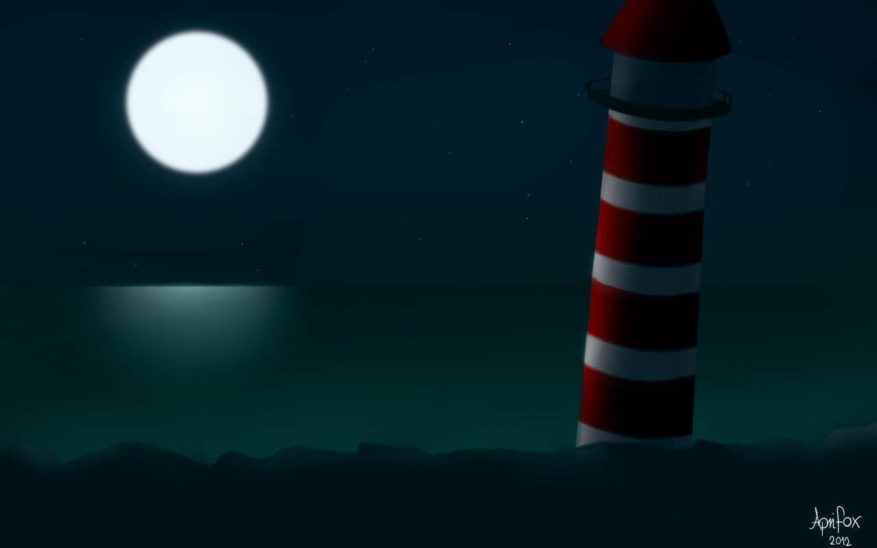
Whee! I finally got to finish a rather promising rough paint. I must say I really like the final result!
However, if you have any suggestions/critiques, go right ahead! It's about me getting better after all.
Paint Tool SAI
6 hours total, divided into two days.
However, if you have any suggestions/critiques, go right ahead! It's about me getting better after all.
Paint Tool SAI
6 hours total, divided into two days.
Image size
1280x800px 185.9 KB
© 2012 - 2024 BuggerTheFox
Comments4
Join the community to add your comment. Already a deviant? Log In
Very promising indeed!
A few things you could do:
Try blurring the edges of the moon a little. It being very far away, the edge is rarely crisp without a high definition camera, and even then the halo effect from light diffusing through things in the atmosphere (most notably water vapor, even when there are no visible clouds) is often present. You could also add the texture to the moon surface (the "man in the moon" or "moon rabbit") if you were feeling a bit ambitious.
Your water is lovely with the colors you chose and the blending between them, but it is also currently perfectly smooth, which would indicated that there is no wind, wave action, or living things disturbing the surface. You could show some movement with a few simple lighter or darker lines going more or less parallel to your beach. The ripples would also disturb the smoothness of the moon's reflection on the water, so if you do add some water movement, don't forget that. Also, the darker area near the horizon stops as soon as you hit the lighthouse when it should probably continue to the edge of your illustration.
You did good with the soft highlights on the lighthouse, but don't forget that light doesn't only fall on the main shape, but smaller things like the balcony as well. Also, remember that since your roof is a cone shape, your highlights and shading should follow the slope of the roof rather than continuing up straight like it is. If your intention is for the lighthouse to be relatively close to the land in the foreground, the lighthouse should be blocking the moonlight from the area behind it, effectively casting a shadow in an already-dark environment.
The rocks could either use a bit more definition, or another layer of shadows; the grey you used for them isn't quite dark enough to indicated real shadows on a material one expects to be dark colored to begin with, especially in this kind of lighting scheme.
All in all, you did well on this and it shows improvement upon some of your earlier work; it's great that you're actively seeking critique.